Affinity
Affinity is an image editor not dissimilar in functionality to Photoshop, though where Photoshop divides its editing capabilities between the Camera Raw Processing (Exposure, Temperature, Contrast…) and Image manipulation (blending, filtering, transforming) Affinity encapsulates both of these functions in a single app. One of the advantages of this approach over Photoshop, is that Affinity always maintains the original colour depth, whereas with Photoshop most image manipulation (as opposed to Raw Processing) results in the image depth being reduced to 8 bits per channel. At least in the version of Photoshop that I have (which I admit is a bit ancient now)
Raw Processing
Comparison of Photoshop ACR with Affinity
Which of the three images above you prefer is, just that, a matter of preference. Contrast, Exposure, Colour Temperature, all affect the end result, and adjusting any of these attributes is not producing a ‘false’ image, it is only replicating variations & adjustments that were undertaken when film was developed.
My personal opinion: The ACR Auto Settings produce an image that is too bland, plus the sky is the wrong colour. (Seems Auto wants the sky to be blue, even on an overcast day). The ACR Manual Settings image is probably the closest to reality. With the Affinity Manual Settings image I have deliberately opted for a semi-extreme set of values. I was taking my lead from James Abbott’s book ‘The Digital Darkroom‘, and whilst the settings produce a more vibrant image, I am not sure this image benefits from this level of vibrancy.
Using Affinity
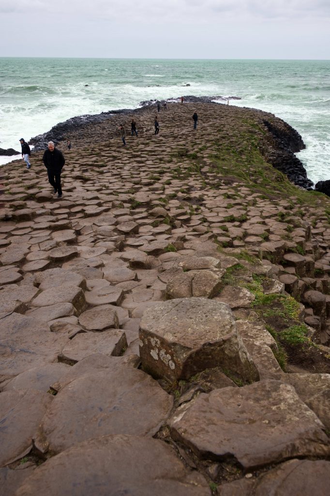
However one image I am hoping will benefit from Jame’s approach is this photograph of The Giant’s Causeway in Northern Ireland
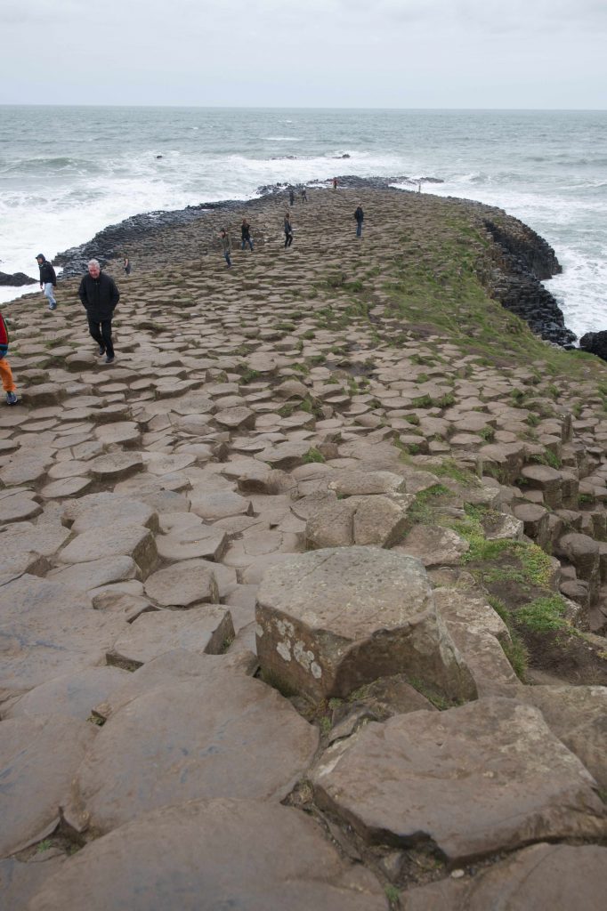
The picture was taken on a windy day in late March 2019 and the image really does not do justice to the drama, beauty, and magnificience of the scene, let alone the raw power of the waves crashing against the ancient formation. So I am going to try to infuse some energy into the image using Affinity and will record the results to give a road map of how we got there.
RAW Editing
When you open a RAW image in Affinity the document willl be opened in the Develop persona. ![]() The Develop Persona is only available for RAW Images, and as the name suggests, is there to simulate the Development Process.
The Develop Persona is only available for RAW Images, and as the name suggests, is there to simulate the Development Process.
Aside: Within Affinity a Persona controls what features and functions are currently available. There are five Personas
- Photo
- Liquify
- Develop
- Tone Mapping
- Export
Only Develop is available with RAW. The other four Personas become available once the RAW image has been developed.
To exit a Develop session you must either save your changes (ie Develop the Image) or cancel all your changes. Once Developed the image cannot be saved in its original RAW format. It can only ever be saved in Affinity’s proprietary file format AFPHOTO, or exported in one of a number of standard formats.
The good news about this approach is that the original RAW image is never touched. The bad news about this approach is that you cannot manipulate the RAW image and then save your changes with a view to continue with further RAW edits at a later stage. (Which is a feature that is available within Photoshop. Photoshop ACR achieves this by keeping the RAW file intact, but having an associated file which contains the edits, and which is always replayed when the image file is opened in Photoshop.)
Which means to record the journey through James Abbot’s processing techniques in Affinity I am going to have use screen captures.
First action – get the Exposure correct, with the Histogram distributed nicely over the whole width, without hitting either limits.

James then recommends adjusting the contrast to raise the vibrancy of the image. He recommends setting the contrast between 10% – 40%. In this image we really cannot go much above 10% as above this causes the faces of the people to appear unnaturally red. So we set the contrast to 10%.
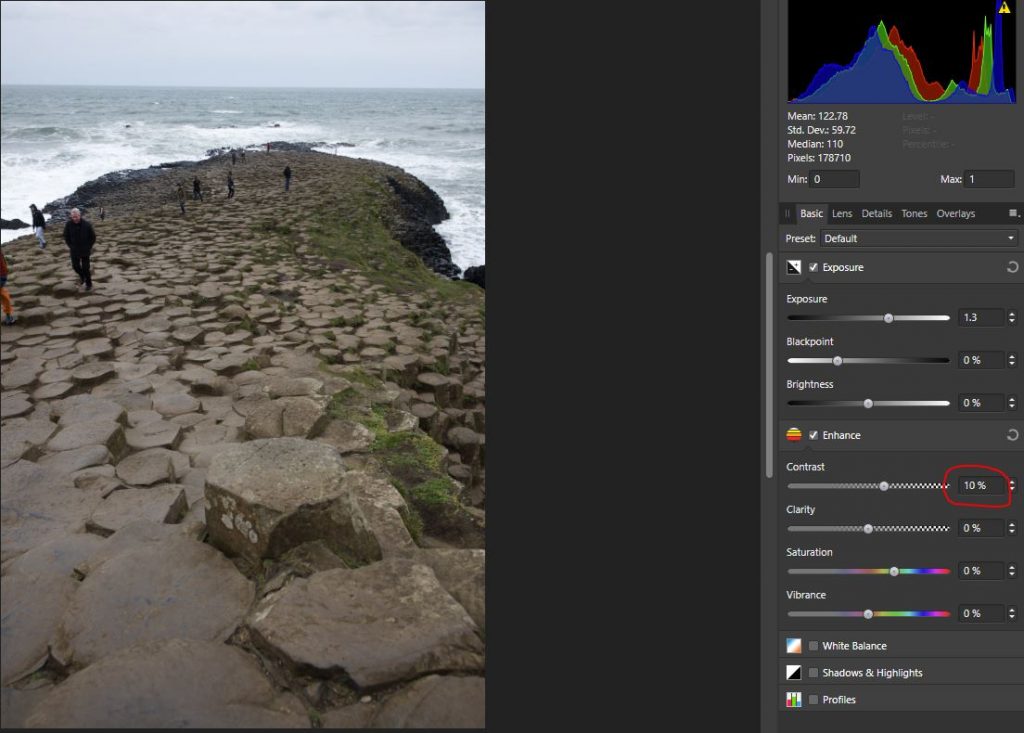
Already the image is beginning to look more intense.
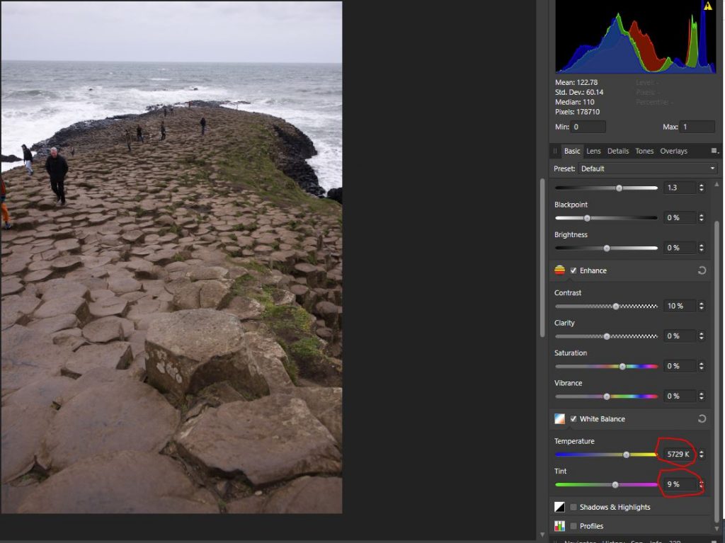
Next consider the White Balance aspects – ie is the image too cold or too warm. In this case I believe there is a definite Blue tint, caused, I suspect be the camera trying to make the sky blue, whereas on this day is was definitely gray. Also the rock colour is too bland. it needs to be more Red, To recify these short coming I raised the temperature to 5729K and gave the Tint a 9% shift towards magenta
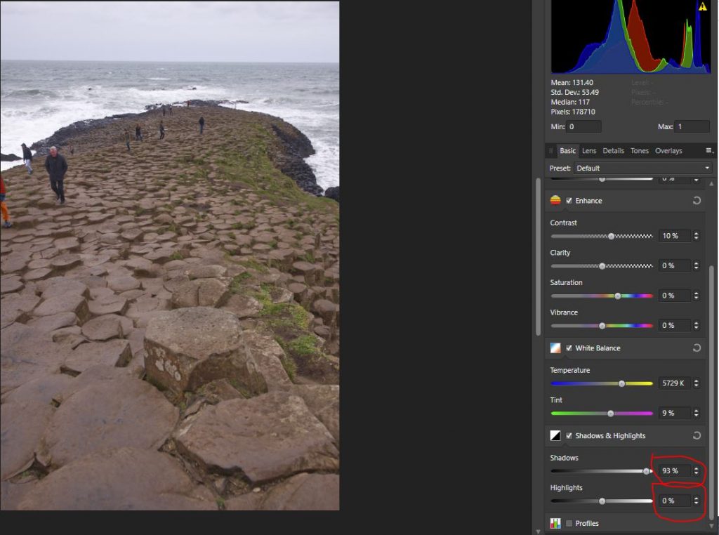
Next we want to try to retrieve any detail lost at either end. I began by raising the Shadows to retrieve any detail lost in ‘blacks’. With this image the Shadows can be raised a long way, and doing so revealed that the coat of the man in foregoround was a quilted blue jacket- not flat black. More importantly the detail within black rock formations either side of the prometory was improved. I did not reduce the highlights, as there is very little White in the image.
The problem now though, is the image looks ‘flat’. What I wanted was to emphasis the Causeway stones and their cyrstall formation. So I raised the ‘Clarity’. Increasing/Adding Clarity does risk clipping at the high end. So I enabled the ‘Show Clipped’ buttons (top right) and pushed the Clarity up to the point where Clipping occured and was visibly indicated. This was around 26%. Now whilst that 26% of clarity did help intensify the Rock Formation, it didn’t go far enough for me, so I raised it all the way to 100%. The good news is that this image has very little at the high end and what clipping has occurred is in and around the tops of the waves, which does little to detract from the image, wheras the intensity of the rock formation is greatly increased.
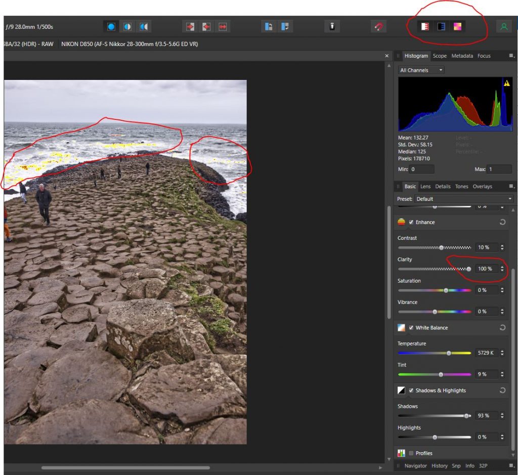
At that point I was pleased with the result, at least as far as the ‘Developing’ process was concerned. So I clicked ‘Develop’.
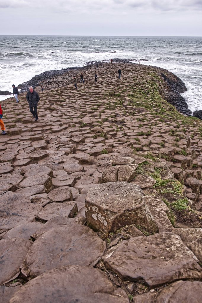
Here are the two images side by side. The Processed image has, IMHO, significantly more intensity & energy. The colour of the stones in more pronounced, and their feature more delininated. Aslo the sea and sky have more features, more action.
The colour of the Man’s face was a touch too ruddy, but what was really missing was the beautiful cyan colour to the sea. Decided I would restore that, reduced the hue on the Man’s face, and then cropped out the slice of the person on the left. Here is the final result.